Ask the Developer Vol. 15, Mario & Luigi: Brothership – Chapter 2
5 December 2024
This interview was conducted before the game was released.
Some of the images and videos shown in text were created during development.
This article has been translated from the original Japanese content.
Chapter 2: Working together for the first time
Chapter 3: Falling into place with the theme of "connection"
Chapter 2: Working together for the first time
While I understand the desire to create this game in 3D, 3D visuals have long been established in Mario action games, haven't they? This could end up making this game's visuals more similar to those of other Mario games. If this is the case, I imagine you needed to come up with a style that’s unique to the Mario & Luigi series while still being 3D, right?
Furuta:
Precisely. Our challenge was to develop 3D visuals that would bring out the unique appeal of the Mario & Luigi series and differentiate it from other Mario games. I'm ashamed to say it, but we weren't conscious of that when development started, which led to us making a huge detour. And in our search for a new Mario & Luigi style, at one point we ended up trying to present an edgier, more rugged Mario instead... (Laughs)
Then we received feedback from Nintendo that we should aim to make the art direction identifiable by fans as belonging to the Mario & Luigi series. After that, we were able to narrow down our focus to how we could combine two things: the appeal of illustrations featuring, for example, solid outlines and bold, black eyes, and the charm of pixel animations depicting the two characters moving around comically in all directions. I think that's when we finally started to develop an art style that's unique to this game.
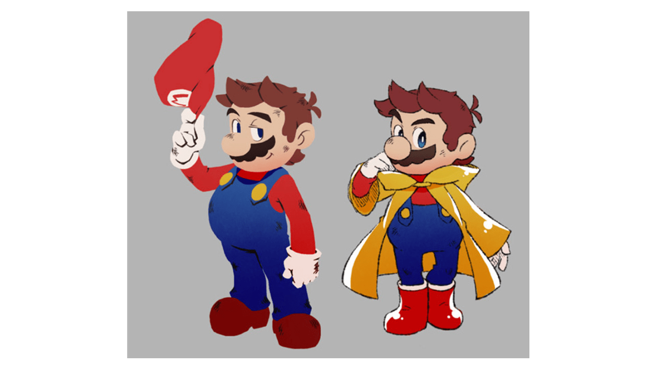
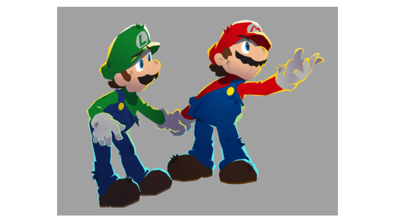
Early concepts for "rugged Mario".
These early concepts certainly do make Mario feel a bit different from the series so far.
Otani:
From Nintendo's perspective reviewing the character designs, they gave the impression of something different that just resembled Mario. So we called for a meeting in order to reassess the direction.
Furuta:
During the meeting, Nintendo showed us a document describing what defines Mario and Luigi in the Mario & Luigi series. Although we'd enthusiastically pitched this rugged version of Mario, when I considered it from a player's perspective, I started to worry about whether it really represented the Mario that players would want to play. So, when we got that clear direction from Nintendo, it made perfect sense to us. I think that's when we realised for the first time, “Ah, this is what we should be aiming for this time in terms of a 3D visual style from Acquire”, and were able to establish the fundamental direction.
Ohashi:
We had a strong desire to experiment with new visual styles, but they articulated their vision to us each time in a way that we found convincing.
Otani:
Yeah, it's like we'd unleashed Acquire into the wild... only to go chasing after them again.
Everyone:
(Laughs)
Otani:
While we wanted Acquire to have their own unique style, we also wanted them to preserve what defines Mario. I think it was a period when we were experimenting with how those two things could coexist.
Ohashi:
As mentioned earlier, Acquire has hardly ever created games with other companies' characters, so we didn’t have an established process for this. That was truly a challenge we faced as we kicked off the development of this game. That said, we were able to course correct at the beginning of development by communicating in the way we just described.
Furuta:
On the artwork side, we struggled with how to embody the characteristics of Mario and Luigi in illustrations, and how to match the expressiveness of the original pixel graphics with 3D models. It's technically difficult to apply styles that were made possible with pixels to 3D, and we made a lot of challenging requests to the character modelling and 3D motion teams. Also, we were set on incorporating drawn outlines, which is one of the characteristics of the series' artwork.
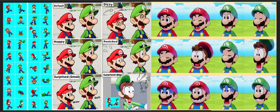
From a technical perspective, achieving this in 3D can be CPU-intensive and limits what can be done visually, but we were determined to retain these outlines and made it our priority. Thanks to the perseverance of our character modelling lead, who has a deep passion for the Mario series, and our technical staff, we think that the art came together nicely.
Ohashi:
Because we focused on the outlines, we were able to differentiate it from the way Mario is depicted in other action games and realised that we'd established something unique to this game.
Otani:
When the announcement trailer was first released in the Nintendo Direct, I saw the excitement from fans that the Mario & Luigi series was back, and I think this reaction can be credited to Acquire's hard work. Not only were the 3D models brought closer to the style of 2D illustrations, but the animations also closely mirrored the movements from the pixel graphics in past Mario & Luigi games.
Furuta:
Our 3D motion team studied the series' pixel graphics in a lot of detail to ensure its appeal would come through. They did a lot of research to depict the movements flawlessly from every angle while preserving the silliness of the pixel graphics. They didn't just replicate the pixel graphics from previous games, they created a style of animation that's unique to this game but stays faithful to the Mario & Luigi series.
When it came to Mario's running animation, we also used Super Mario Odyssey (8) as a reference, studying the feel of the controls closely. The 3D motion and programming teams were constantly tending to the game and kept making adjustments. For example, making it feel more satisfying for players through things like the responsiveness with which Mario's body tilts when running around corners.
(8) An action platformer game for Nintendo Switch released in October 2017. Mario goes on a globe-trotting adventure, borrowing the power of Cappy, a resident of Cap Kingdom.
Ohashi:
We alternated between working on something and asking Otani-san to try it out.
Furuta:
While it's essential to get Mario's look right, we realised that he's a character for which the fun and satisfaction you feel through the controller as you're playing as him are just as important.
Not only are Mario and Luigi rendered in 3D for this title, the world where their adventure is set also features original characters. Were there any challenges creating those characters and the world they live in?
Furuta:
It wasn't exactly smooth sailing. Connie, an original character that appears in this game, was initially designed to look like a human. Afterwards, we settled on the motifs of outlets and electric plugs, and the ideas of an outlet-like face and a plug design that looks like a hat fit right into that world. Eventually, we landed on the current design.
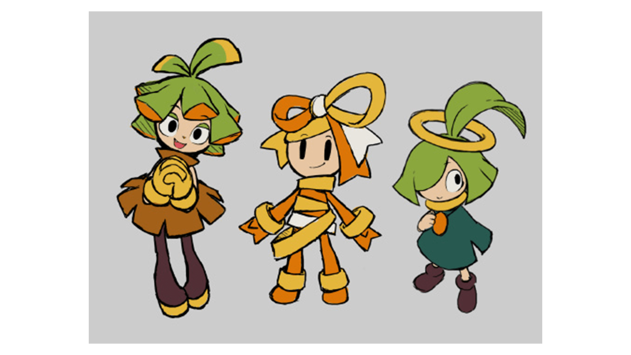
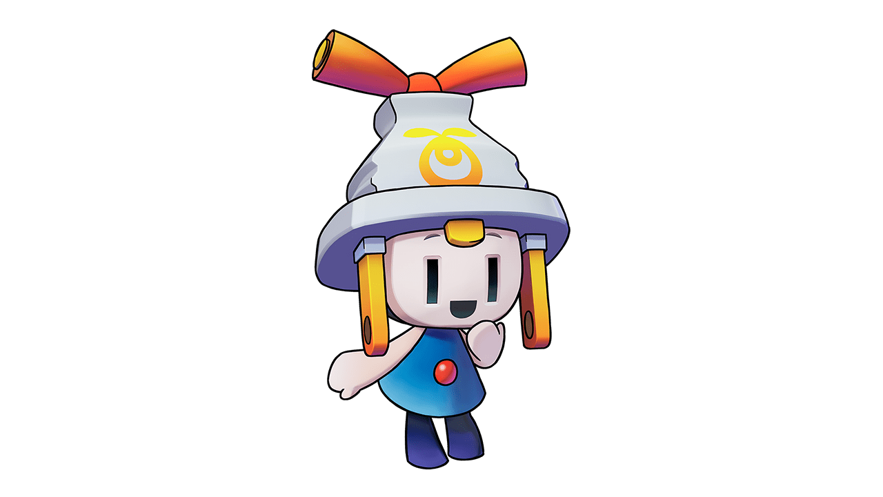
Early concepts for Connie (left) and the final in-game design (right).
Otani:
If other characters looked too human, for example, you may end up with a world where Mario seems superfluous as a protagonist. When creating original characters, it's important to develop characters and a world that Mario wouldn't feel out of place in. From that perspective, Acquire has studied the previous games in this series very closely to achieve this. Furuta-san, your efforts came across clearly in the development materials you shared with us. There were a lot of hand-written comments representing your inner voice, such as, "This should work this way... Nope... do it all over". (Laughs)
Furuta:
Oops... (Laughs)
Fukushima:
But because you wrote down everything you were struggling with, it made it easier for us to discuss solutions together.
Furuta:
Yeah, I guess you're right. (Laughs) Especially during the initial phase of development, I thought it'd be better to communicate to Nintendo what and how we thought, as well as what we didn't know, because we were working together for the first time. So I put everything in writing as it came to my mind.
Otani:
Speaking of original characters, if we only had Mario and Luigi's reactions to go on as the story developed, we'd miss out on some detailed information. So that necessitated a partner character for them. That's how the partner in this new world, Snoutlet, came to be.
Furuta:
Since the decision for an electric plug as a motif was made early on, we considered various options regarding what form Snoutlet should take, including whether to go for a plug-shaped design.
Ohashi:
I was intrigued by one of the ideas that came out of this – a piggy bank-like character whose features could either look like a nose or eyes. Snoutlet is my favourite. (Laughs)
Furuta:
We first designed Snoutlet so that the eyes were at the top of the head, but while leaving just the eyebrows, we made the nose look like the eyes so it's fun to guess where the real eyes are.
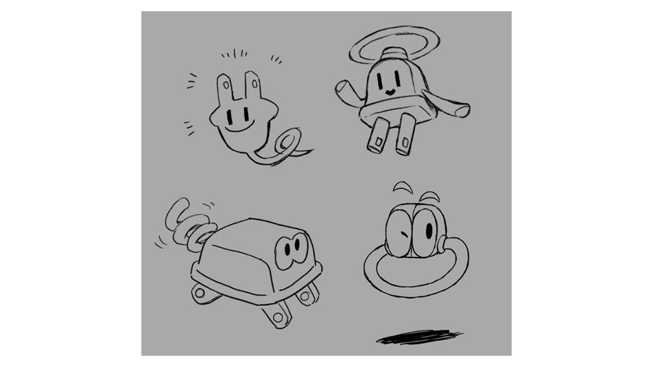
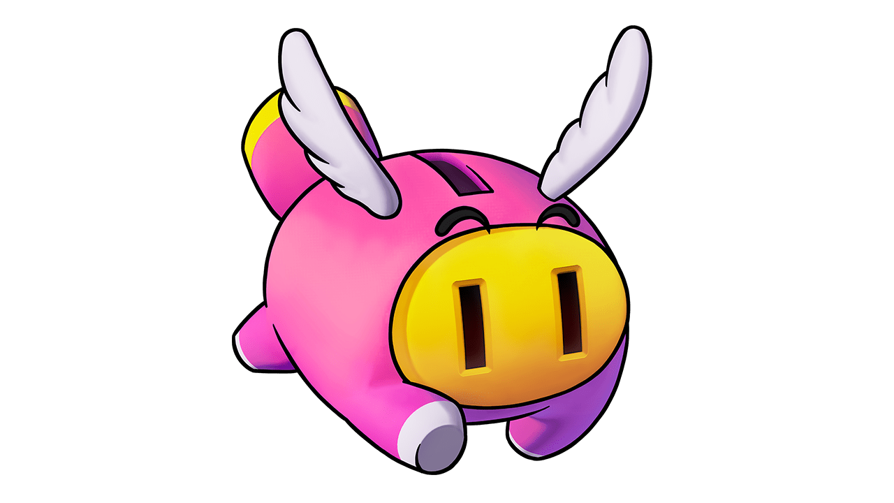
Early concepts for Snoutlet (left) and the final in-game design (right).
Fukushima:
Also, I've heard that piggy banks exist in many countries around the world, so this might help Snoutlet's design be recognisable. And we were glad to see the "Shipshape Island" idea. The moment we saw it, we thought to ourselves, "This is it!"
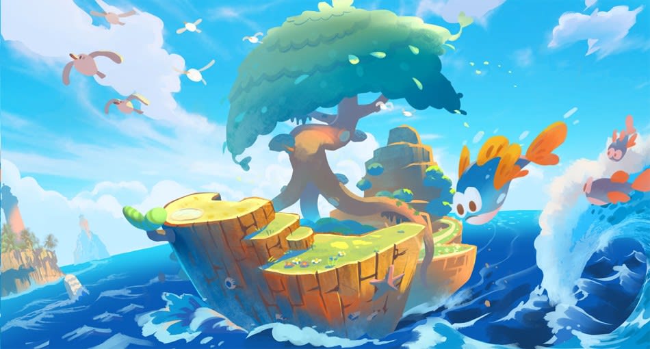
Furuta:
This is the initial concept art of Shipshape Island. We called the first base "the starting island", and while considering a number of shapes for it, a staff member proposed the idea of an island shaped like a ship. Everyone on the team thought it was a great idea, and we unanimously decided on this design. This shape clearly communicates its functions as a base of operations for their adventure, and from there, various other designs took shape, one after another.
Otani:
Since the base is an island, it drifts along the ocean rather than being steered at will. So, it didn't feel quite right for it to be a real ship. I think that once it became an island shaped like a ship, its appeal really grew.
With its backdrop and surrounding atmosphere, it's extremely colourful.
Ohashi:
Because this game is a part of the Mario & Luigi series, there's no room for gloom with the overall atmosphere. We wanted it to be full of brightness and fun.
Furuta:
When left to our own devices, we tend to get drawn subconsciously into the heavier directions you find in more serious RPGs. Although we were still getting to grips with the mood in the Mario & Luigi series, we decided on this direction so we wouldn't forget that it's a stage for fun, chaotic adventures. This doesn't only apply to the game's world, but we learned a lot from Nintendo's unique design perspective about making things easier to see and understand. The world turned out brighter and easier to play due to the insights we gained.
Once the game's overall art direction became clear, did that lead to smoother communication and move the development forward?
Otani:
Well, um... In a sense, this series is too "colourful". Although it's a game in the Mario franchise, there's so much goofiness. Also, the previous development company, AlphaDream's colours show up strongly. Our request was like asking Acquire to replicate a delicious bowl of ramen from another restaurant without the recipe. It must have been a huge challenge for them.
Furuta:
We were trying to replicate that delicious ramen by eating it and guessing, "We...think this ingredient is in it?". (Laughs)
Everyone:
(Laughs)
Otani:
Because it was our first time working together, it took a while to get those fundamentals down. But it was only from that point on that we finally started work on the actual game content.