2. The Other Screen
Up until now, there was an appliance called the television that was always in the centre of the living room, and video games always needed to use that setup in order for it to be played. (Genyo) Takeda-san3 often puts it as if it's a parasite to the TV! (laughs) But what would happen if video games had their own screen? That idea resolved a lot of the issues we had been feeling, right? 3Genyo Takeda: Senior Managing Director of Nintendo and General Manager of Integrated Research & Development Division. He is responsible for the development of Nintendo home consoles and systems such as the Nintendo 64 system, Nintendo GameCube system and the Wii console.
That's right. Lately, the television in the household is being used for more purposes than ever. The internal system has become more complicated, and it has become something very big and bulky where it's taking much longer to turn on. The Wii console did have the blue illumination lamp to notify of new messages, but the amount of information a lamp could get across was limited...
It was only able to say whether there was new information or not, so it had limits on what it could do.
Yeah, so we started from the notion of "It would be nice if there was a small monitor of sorts other than the TV, where we could always see the status of the Wii console."

We had a lot of discussions and experiments, including things like where this small monitor should be.
Right, although a larger screen is more attractive, we debated about things like how a bigger screen wouldn't work within the budget constraints... it went in many directions. And as we were working on it, the situations surrounding us worked to our advantage. It felt like we were able to get closer to what we were originally envisioning.
When we were making the Wii Remote controller, we talked greatly about how we needed to make it so people who had never played video games could use it without feeling overwhelmed by it. We thought that it shouldn't have too many buttons and control sticks, and thus the Wii Remote became something very simple in form. On the other hand, when we were making this new controller, we heard from quite a few people who had seen what we had done with the Wii Remote, wondering why we are putting buttons and Circle Pads on it, and that it should be much simpler. But Miyamoto-san, I remember you strongly opposing those comments saying, "what are you thinking!" I remember that moment clearly. Can I ask you to talk about what you think about people saying things like "I wish the A and B Buttons would disappear", and "you don't really need the Control Stick".

Um, sure! (laughs) Well, I do proclaim rather boldly and tell people to not be afraid of doing things and to challenge new things on a daily basis. On the contrary, I'm rather conservative.
Bold but conservative? (laughs)
Bold, but cautious, I have to be. Not one of our customers is the same, so I think about it from the point of view of someone who has dealt with games for years, and at the same time I also think about how it will appear to people who have never played games. Back when we made the Wii Remote, our core design philosophy was how to lessen the number of buttons without losing past gameplay standards. Even if it was just one button that we were talking about taking out, I think I was the one who twisted my head over it the most.
Yeah.
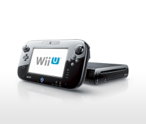
So to those people who said things like how we should leave more buttons on it, I think "I completely understand. But that is exactly why we need to do it this way. There can be a new gameplay standard ahead of this." That's how we made the Wii Remote. With the new controller this time, it has a Touch Screen here, and you can see information on it at anytime that won't appear on the TV. So, on many levels, it's a tool that makes things easier to understand. So by taking advantage of it, we can think about designing bold, brand new games. On the other hand, as we had to think about the resulting size of the new controller, I came to think that rather than focusing efforts on just trying to make it slimmer, we should focus more on designing it so that the potential for us to be able to make a variety of new things can be further expanded. On the flipside, if it were all just buttons, it would have become a device that people would be overwhelmed with.
This time there is "the other screen."
There is. Because it has its screen, it's become much easier to understand, and we thought in that case, we'd stuff it with features so it could do anything.
In a way, it's a classic controller with a screen.
I think so. It has many faces. If you look at it this way (turns the new controller around), there are two L and R Buttons.
And those who don't want it (buttons and Circle Pads), do not need to use it.
Yeah, you don't have to use them at all. You can hold it this way (vertically) or this way (horizontally) and mostly use the Touch Screen. And here around the bottom of the screen it has the same layout as the Nintendo 3DS system so you're able to go to the HOME Menu with the press of a button . It also has two analogue Circle Pads . You can come up with many ways to play.
