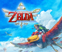
5. Watercolour Art
Iwasaki-san, shall we talk about the items?
Sure.
What does someone given the task of creating the items in The Legend of Zelda think about?
There are all kinds of items, but first you think about where it was made.
Where the item was produced.
That’s right. An item from Skyloft was designed and made by the people who live there.
Skyloft is in the sky, so it’s separated from the surface world.
Yes. Then I imagine all sorts of things. Skyloft is a pretty simple land, so rather than finely detailed patterns and gorgeous designs, they would probably favour simple items. And they would use motifs drawn from things familiar to them like clouds and birds.
You design as if you yourself have become a resident of Skyloft.
Yes. There are, of course, lots of things with birds drawn on them and I figured there would be designs featuring things like wings and bird footprints and the wind and so on, and included a motif like that on the shield.

That’s right. While the people of Skyloft use simple designs, next there were items made by the goddess and the ancient civilisation. For those, we thought of things made of a mysterious metal or mysterious material that is oddly smooth.
You design with the land where it was made and the culture behind it in mind, so each item takes on distinct characteristics.
Yes. I design so that you should be able to tell at a glance where an item comes from.
I worked on the Skyloft landforms. In making a single house, first I ponder over whether it is made of wood or brick or whatever.
Your imagination starts there.
Yes. It’s a body of land floating in the sky, so it would be strange if lots of trees grew there. The wind is strong, so they wouldn’t grow very tall. That would make trees valuable to the people there, so they wouldn’t use a lot of wood as building material. The designers and I imagined various things and said, “They must be earthen.”
You even think about the building materials for buildings.
Yes.
I see. In order that the designs feel natural, you think things over from a number of angles that never appear explicitly in the game.
That’s right.
Speaking of design, the art this time presented a new challenge.
Yes, it did.
It isn’t the smooth photorealism so characteristic of computer graphics, or the cel-shaded animation12 of The Legend of Zelda: The Wind Waker. I sense a strong will toward designing in a new direction. How did that come about? 12Cel-shaded animation: A type of 3D computer graphics technology that renders 3D data to appear like it is from a cartoon or an illustration.
Since I’ve never been that good at video games, I wanted to create an atmosphere that would be easy for people like me to get into. So we tried to make an impression that would be bright and colourful throughout. Something that doesn’t look scary at first glance is easier to get to grips with.
I do feel like even the dungeons got brighter.
Another reason it’s brighter is that we paid a lot of attention to making it easy to see.
If the screen is dark, it’s easy to get confused.
Yes. We talked about how it was necessary in this Legend of Zelda game to make it easier to tell where things are, where enemies are, and which paths to follow. So for an item like the Bomb, we made it easy to tell that it is an object for using.

You made it so the objects and characters don’t get lost in the background.
That’s right.
But if you take that too far, objects would stand out too much. Was that a problem?
Yes, that was what we worried over most.
For example, if you watch really excellent animation, the backgrounds are incredibly detailed and realistic, and the characters moving around in front of them are drawn in contrasting, simple lines. But they don’t appear out of place.
That’s right.
I think this new challenge must have been like that kind of animation. Nothing feels out of place. Why do you think you were able to do that?
Early on in development, we had made not just the backgrounds, but the enemies and objects in a watercolour style as well, but everything - including enemies - blended into the background. You couldn’t pick out your goal at all. Then we used half-toon rendering, which is similar to cel-shaded animation, to represent characters and other aspects, to make them stand out.
You used cel-shaded animation for certain parts.
Yes. When we tried using that technology, it didn’t look flat like with cel-shaded animation, but a little airy and soft. As mentioned earlier when you were talking about animations, the backgrounds were realistic and simple, soft characters were moving around in front of them, and it didn’t feel off at all, so we thought, “This might work!” But even then, problems arose here and there with some things standing out too much and some fading into the background. After that, we made constant checks, finely adjusting the colours and brightness, adjusting the watercolour of the backgrounds, the lighting...
Oh, you adjusted each thing with precision.
A lot. At the end, we ended up working until morning as we made adjustments.
We really adjusted each one. For example, things like grass and trees, things you just simply enjoy a reaction from, they can blend into the background somewhat. People who notice them will enjoy them. But for other objects...
If players don’t notice them and can’t solve the puzzle, then they can’t move forward.
Exactly. We adjusted each thing so that even though they look natural in the watercolour style the players will notice what is there.

How about items?
The Bomb this time is light blue, but at first it was darker. When you went into a dark underground stage, you couldn’t see it.
It would be a problem if you couldn’t see the Bombs! (laughs)
Yes. So we made it a lighter colour that would be clearly visible above ground or underground but still fit in with its surroundings.
You were able to pull off the watercolour-style art because in the end everyone joined forces to adjust by hand what you had each been in charge of earlier.
That’s right!
